Monday, January 26, 2015

Amazon Book Art: Echo of Bones (poetry book) by Molly Middleton Meyer

TITLE: Echo of Bones, a collection of poetry by Molly Middleton Meyer


COMPANY: Mind's Eye Poetry

"I'm on a mission-a mission to rewrite dementia.
 Despite what is often portrayed in the media,
 people with Alzheimer's disease are not lost. 

 They still possess the ability to experience joy,
 to think, to laugh, to create.
 It is with this belief in mind,
 that I founded Mind's Eye Poetry."

-Molly Middleton  Meyer


COMPANY LINK: http://www.mindseyepoetry.com/


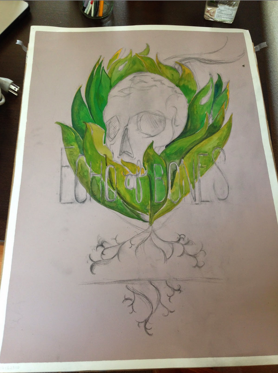
PROJECT:
Commissioned to design and illustrate the body of work "Echo of Bones."
This included the creation of the cover art and digital book layout. In addition, the poet hired me to research and secure a printer to produce the book. 


In describing her book, Molly writes "Echo of Bones, features poems inspired by my experience with Alzheimer's disease, and the courageous men and women who live in the moment, who live in imagination, who live in memory."


DESIGN:
Cover Art


CONCEPT: 
After reading the body of work completely, it was clear that the reoccurring themes in the poems are the ideas of what it means to feel "loss." It was clear to me that the cover art be executed traditionally with paint and paper. I based the cover art on the following themes: loss and rebirth (cycle of life), strength through resilience, and finding beauty within the process of all stages of life. 

INSPIRATION:
Through my conversation with my client, As a long time resident of Arizona, I discovered her deep rooted attraction to southwestern art. Both being admirers of artists such as Georgia O'Keeffe and Frida Kahlo, was information I needed to proceed to my thumb nailing process. 


THUMBNAILS:
Every artists has a different method of creating thumbnails. Some are more detailed than others but essentially you are depicting your idea through composition, and image references. Remember the brainstorming process should be a free and creative experience.
No idea is a bad idea. Through the nuances of sketching digitally, or traditionally can sometimes push an idea further than originally anticipated.

Together with my client we choose the bottom right thumbnail. 
When creating my thumbnails based off my concepts, I specifically choose an Aloe Vera cactus for it's healing properties. (I toyed with the iconic image of "Cabbage Patch Kid's Logo) by placing the skull in the middle of the Aloe plant. Using the older reference I was able to depict the cycle of life concept but through a reverse perspective. Having a skull represent death/old age emerging from where new growth should be located. The last important characteristic to note was to have the mouth covered 


*Note: An illustrators job is to create meaning through intentionally choices. 


FINAL SKETCH: I typically use "Saral" transfer paper when relocating my final sketch to the paper in which the piece intends to live upon. Once you have your final thumbnail all detailed, I would blow the sketch up to be the same size of the material you intent to transfer it to. When I transfer the sketch to the paper, I do a rough transfer. I do not copy the exact sketch to paper. It is my experience that work looks better when I roughly transfer over big shapes and fill in the detail by redrawing it again. 


UNDERPAINTING: Depending on the type of medium you work with, know your limitations of building your values. Painting is very similar to cooking, in the sense that you can always add more, but is harder to subtract. Learn how to be free through experimenting and salvage through practice. When I use watercolors or gouache I work light to dark. 


Revisions: The piece seemed to be missing an element. I revisited some of Frida Kahlo's work is abundant with flower crowns. One of the poems from the collection "Black Iris" the poem re-inspired me to give me an element I felt the piece was missing.

Black Iris, 1926

"If you take a flower in your hand and really look at it, It's your world for a moment." Georgia O' Keeffe.

She says flowers are androgynous.
But I'm not. I'm all woman.
Come closer. Look, I don't mind.
Now take your timid fingertips,
trace my tendrilled folds-
swirl them into white,

slip them into pink,
plunge them into my
purple-black beginnings.

Feel my seeds swell and burst
under one moon.

--Molly Middleton Meyer 


FINAL PAINTING: I suggest before framing a piece, always spray your paintings with UV ray protective sprays. The spray prevents color fading and comes in all types of different varnishes (matte, semi matte, and glossy.)  


SIZE AND DETAIL: 
Echo of Bones: 24" x 32", mixed medium: watercolor, colored pencils and gouache.  


PRINTER:
Do your research! I spoke with over eight different printers before I chose "blurb" Today, we are fortunate to have a variety of options in printing techniques. It can be confusing at times, to make sure you are choosing a printer that believes in your project and meets your client's requirements (costs, timeframe, quality and customer service needs.) 


CONCLUSION: I would highly recommend blub. They have a wide range of printing options--enough to give you choices, but not to the point that you feel overwhelmed. In addition, their customer service is topnotch. I emailed their team once a day for a week and recieed feedback within the hour. My only criticism is that perfect binding left a little bit of bubbling. I would have preferred a more flush technical job, but overall satisfied with the end product.


PUBLISHED:
After the book was displayed at my client's senior thesis show, the book was picked up by the publisher Red Dashboard  and you can not purchase the book on Amazon.


SPECIAL THANKS:
Bob Dob my professor at OTIS College of Art and Design for the guidance on working with publishers. Check out his work at 
Bob Dob and to Molly for letting me be apart of this beautiful project. 


Tuesday, November 19, 2013

"The Unforeseen Embrace" - Horrorwood WWA Art Gallery: Culver City, CA

TITLE: "The Unforeseen Embrace - The Ring the American Version" 
DETAILS: Mixed medium: ink, gouache, and watercolor paint. 
                Produced on Reeves Coldpress paper at 90lb and pre-stretched.
                Size:  26"x38" 
PROJECT: THE WWA Art Gallery in Culver City, invited me to participate in their annual Horrorwood Group Show. 
Horrorwood is a show curated based off of classic Horror films. 

I wanted to talk a little bit about my process. It begins with a concept that best fits the theme. Once I have the direction of the composition and subject matter, I create a final transfer sketch. This is the time where you should feel free to "flow" let creative mistakes become apart of the final.

When your line work is tighten up (almost like a road map) your ready to transfer. I typically work on paper products so using a light table is the way I transfer my images. 

Original Sketch


Use reference photos, they're your best friend. I have a ton of photos on my computer of myself and of friends who have modeled for me. Understanding light, form and color only make images stronger. It's extra work but totally worth it. 


If you have seen the movie "The Ring" the American version you know the climax scene is extremely green.
A lot of the undertone painting is yellow and green. At one point my painting was looking like the jolly green giant.
I had to cool it down with some purple.

I find it successful painting my lights first and darks last. Be conscious when adding your darks. Remember the rule about baking a cake and adding to much liquid? The same principle applies here. You can always build darks but it's difficult to remove dark colors.

A great alternative to painting on top of heavily darken watercolored areas are using a x-acto blade to scratch the paper. If your paper is white the light paper will shine through.

In my painting I used gouache to highlight some darken areas on"Samara" (the long haired girl.)  

Note on using gouache. If you have ever painted with oils, gouache is very similar. It typically will pick up the colors you have placed underneath even if the paint is already dry. Again try to paint light to dark. 


Under painting: With watercolors I work backwards painting my lights to darks


Raw Image, fresh off my painting board: I shipped the piece to LA from Oakland to be framed.


As an illustrator, it is in my nature to be a story teller. Participating in group shows you are surrounded by a community familiar with similar stories and backgrounds in pop culture. I find it gratifying adding small details that grabs the attention of a die hard fan or a curious spectator. In the American version of the ring, the mere sight of water signifies danger. I added small bolts leaking water from the paper, to imply "Samara" unlimited potential to travel between both land and water.    


<3 

Thursday, September 26, 2013

Music is Art


I finally feel settled in the Bay area. With all of the hustle and bustle that comes attached to moving, it's comforting to know my music and art help me retain my sanity.
I can not believe I am actually going to be say this but I actually miss the tedious production of creating a mix CD. My last automobile was a 2000 Nissan Altima that was completely devoid of any AUX jax. Therefore the previous 10 years of owning the vehicle I was a prisoner to my CD player. I was reduced to these bulky tangible discs that would create nothing but clutter and distress to my life. Oh man! The griefs of skipping a songs due to a tiny little scratch. A scratch created none other than a fellow CD member! Overall I am grateful I experienced the frustrations of that terrible bebop system. In the end it only made me a better producer. 

Since listening to the radio was to repetitive and adolescent for my taste, I developed skills on how to produce a timeless mixed album. When I began my first mixing endeavors during high school I would create mixes very carelessly. As time went by my expendable time became limited and I based my mixes on emotions opposed to trends and fads. 


After selling my automobile ("VanilliaBean" you were a fabulous 2000 Nissan Alitma and I will never forget you.) in December of last year it has been about 10 months since I created a playlist. All of my friends encourage me to open a Spotify account. I have my reason for being anti Spotify but happy to announce my very first Soundcloud playlist.

Without further adieu here is my first online playlist. It's a compilation of tracks from the past 5 years that best describe my vision of a future romance. I am envisioning a dark and deep sexy adventure. The other day my co worker commented that my music reminds him of ambiance porno music. #fml.

Soundcloud allows you to import your own album cover art for playlists create. Immediately, I began rummaging through my instagram. Below is an image that spoke to me about my new beginnings in the Bay area. 


I took this image on my way to my first interview in the city. It felt appropriate that I use this image to represent the first of many new playlist to come. 

I manipulated the image to represent this concept: a square peg can not fit inside a circular hole. Magic occurs when everything flows and fits together perfectly. 
Soundcloud Playlist Title: Cheers to the Imaginary Love of my Life

Monday, May 13, 2013

Head Shots: Thi Nguyen

Yesterday my dear friend Thi and I decided to have a photo shoot. As an L.A. based actress our goal was to capture 5 new looks in a one day shoot. A little ambitious perhaps but luckily for us this was not our first time prepping for a photo project. You can find more information about Thi here: http://msthinguyen.com/


Working and helping your friends accomplish their goals is a gift in itself. No one can accomplish large projects by themselves. This shoot was the second and we both observed our personal growth as a model and as a photographer. We completed our shoot within a more efficient time frame and larger variety of looks.

One particular memorable moment was on on third look - "hipster look". At first I began art directing Thi. I would communicate to her how she was photographing. "Your chin is a bit to high" or "can you turn your body more?" I would say with the additional "Be sure to relax and shake out you body." The point is to make your model feel comfortable and let them know how they come across in a shot.

After 5 mins of directing we stopped talking to each other. This is what I call flowing. Flowing is when you give your model the permission to get into their characters and the photographer becomes invisible. Thi got to do what she does best which is act and I basically follow her lead. Once I felt she was in the right pose I would snap and then so on and so forth. In my opinion the best images are always the candid ones. If you allow people to be natural and play your images will capture with that authentic energy.

As someone who personally take photos almost every day with instagram. I admit that the best way to become a strong photographer is to do what Annie Leibovitz says "Take a ton of photos, know how to edit and it's about the story/series." You can find her interview here.
http://www.theverge.com/photography/2011/11/17/2569568/annie-leibovitz-iphone-4s-camera-brian-williams


Here are some of my favorite shots from the shoot. I hope you enjoy them.
Thi Nguyen - Los Angeles Actress 
Shot #1: Hipster/Artists Look


Before


After

Color Correction - Use your Curves RGB palette in Photoshop. It give you more control than Color Correction in Adjustments. Make sure you are using RGB for web and CMYK for print. 


Shot #2: Sport/Athletic Look


Actress/Model: Thi Nguyen
Wardrobe Styling, Hair and Makeup, Photographer/ Art Direction and Edits: Krista Turner
Special Thanks to: Jaemin Yi http://jaeminyi.com/ and the overcast Venice, California Weather.


Friday, May 3, 2013

Paper Goods and Window Displays


Summer being right around the corner I'm inspired by all of the blooming flowers.
To celebrate the season change I created a few new floral pieces to bid winter adieu! 


Salon NESOU in Santa Monica is one of the leading taste makers in hair and fashion industry on the westside. Between their involvement with updated trends and advance educational courses, no wonder their staff participates in events like NewYork Fashion Week and other LA red carpeted events.

More importantly NESOU is an environment filled with an engaging group of artistic individuals who simply put adore what they do. The goal here is to guide individuals to play and discover a look that reflects the way they feel on the inside. NESOU is a community of laid back fashion forward artists. Here is the website to NESOU. I redesigned their website and took majority of all of the photography. http://nesou.com/


CONCEPT: My goal was to create a tagline that reflected the salon's aesthetic and the season. "NESOU Loves Santa Monica." A short and sweet sentence that gets to the point that the city is not only NESOU home but the staff here helps to creates that culture. With Spring and Summer being one of the dominant seasons for weddings, the window display had to reflect those values of togetherness and rebirth. Essentially the display is a romantic picture frame or wedding invitation. I designed a 3D floral frame made 100% out of paper. To give the appearance that the frame is floating I used 5 invisible fishing lines. With the remaining flowers I staggered them in the far left window to give the display a more cohesive look.

After I designed the display I assembled a team of five stylists to help execute the production of this piece.Special thanks to: Marcus Hoey, Katie Chandler, Lawrence Gonzales, Jessica Lyu and Taylor Hood.


DETAILS: 8ft x 5 ft  / paper window display


Monday, April 1, 2013

Brainstorming Back to Basics: Stationery Project 101


This year I am going to be launching my own stationery line!
Big news right?! I couldn't be more happy to announce this exciting news to the world.
I have assembled my team of friends, supporters, mentors, and my courage.

Even though most of the work is done. In terms of marketing and branding I still feel light years away from completion. I spoke with my dear friend Danielle over at TALLWORKS today and she said beginning at the basics is the best way to start fresh.

Today I am working on a new name and playing around with the feel and look of my personal aesthetic. Here are some mood boards that I worked on today to grasp inspiration.

When I begin any creative process I would say mood boards and bubble graphs are a great way to cultivate new ideas. I also agree with Danielle by trying to be as specific as possible and avoiding words like "good" or "cool" the less specific the more you tend to remain in limbo.


[Support the Artists of the World]
Reference Photo Credit to:

Jon Contino - http://joncontino.com/
 LuvAj - http://www.luvaj.com/
Hello!Lucky - http://www.hellolucky.com/
Max Wagner - http://maxwanger.com/
Christina Winklemann - http://christinawinkelmann.com/
 Mylan Nguyen - http://www.mylanski.blogspot.com/
Ken Garduno - http://www.kengarduno.com/
kristatomic - http://blog.krisatomic.com/
Crooks and Castles - http://crooksncastles.com/
the hill-side - http://www.thehill-side.com/lookbooks/ss-2013 
papersource - http://www.paper-source.com/


Monday, February 25, 2013

Portfolio 2013


I have recently revamped my portfolio for 2013.
Here are some images of my new and improved portfolio.

Portfolio is a 24 pages book printed dual sided binded together using a two valley fold and an inside pamphlet stich.