Friday, December 14, 2007

Dialogue Painting

DIALOGUE:
In this painting I had to find a letter and illustrate it. I found this priceless letter my brother wrote my dad when he was about 7 years old. He's begging my dad to adopt another baby from Korea. In the initial sketch I literally had a baby sitting on the ice cream. That was such a problem because it implied cannibalism ha.ha.ha. Anyhow, I thought if I change the baby to a sketch then I could create a scene with crayons and maybe imply school. Yeah I was on to something. I am going to fix this painting too. I'm excited to see what my brother has to say when he see the painting.


This was one of the most challenging paintings I have ever completed. There is no black boarder around the original painting. I think this painting took such a long time for a couple of reasons. Conceptualizing took forever. I had eight pages of thumbnails front to back alone. All of the thumbnails made it hard to commit to an idea. Every time I start a painting it is such a scary feeling because I am reteaching myself how to paint. I get really nervous because I don't want to ruin my painting. Eventually I have to get it done. The skin was giving me so much trouble. I still need to brighten it up a bit but I have a better understanding of what colors (especially yellow/color of light) that brighten the painting without making the skin look chalky or neon. My goal over break is to do a small skin study in acrylic every day. I am going to try to incorporate more graphics in my painting. I really like the look of combining rendered areas with simplified graphics.

Heaven and Hell

H,E DOUBLE HOCKEY STICK:
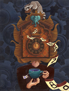
Our teachers for this project divided the class into two groups. One group would be illustrating their idea of hell and the other would illustrate their idea of heaven. I was given hell. I wanted to depict my idea of HELL which is to loose one's memory as hell.


This is my process that I usually go through when I create a painting. There is a week of thumb nailing and brainstorming. Then once I pick the idea a bunch of comps are done to pick which composition works the best, then the final idea with placement, final drawing (rendered) and then painting process. I was told at my last review I should experiment with a different color palette and increase my contrast in values. I will be fixing this painting over break.

Limmerick Painting

LIMMERICK:
The bottle of perfume that Willie sent
Was highly displeasing to Millicent;
Her thanks were so cold

They quarreled, I'm told,

Through that silly scent Willie sent Millicent


IMAGE:
I wanted to create a piece that looked the same from upside down to right side up. I think it works but more as if the viewer were looking down at the painting. The fins on the painting from the smoke are a bit uncomfortable because I did not emphasize it enough. So I fixed it Photo shop.


Oils


These paintings are from Sophomore year. It was the first time someone actually taught me how to use oils properly. The top three paintings are forgeries of Van Gogh and Da Vinci.
Last painting is of Evan. He has a painting looking down at me with a rolling pin. Hopefully, I can find a photo of his painting. Painting on Canvas than canvas board is was easier. On canvas it's much easier to push the paint around where as the board the paint gets stuck with in the groves. Next semester I am really looking forward to painting with oils again in Bob
Dob's class. I want to paint on wood boards though.

Digital Painting


I took my first digital painting class this year. I find digital painting to be more of a tool that a profession. Also digital painters are usually concept artists. I don't find my subject matter to be as scifi or twisted as concept art is. I love Cecil Kim he is the best teacher ever. He actually just did some concept art for a new Pixar movie. The new God of War game is going to be amazing and that is all I am going to say! The bottom sketch was based off a slogan including the statement "_ yourself." My statement was "treat yourself. " I may show the painting when I add some final touches. Right now the background lighting looks pretty pitiful.

Post Cards

POSTCARDS:
This was a project from Sophomore year. Our project was to create postcards that reflected our Otis experience. A lot of people we taking a negative perspective on the project. Meaning that their Otis experience left included being sleep deprived, smoking, etc. I wanted to display how Otis is a positive place of growth and greater thinking. Coming from Arizona where the art level is considered a joke compared to L.A. I wanted to express my gratitude to the school.


MATERIALS:
I used a variety of different materials in these postcards. I used lots of modge podge and the laser cutter. 


Photography

SOPHOMORE YEAR PHOTOGRAPHY:
I really love the beauty in traditional photography. I must admit that my love for process make me love developing the photos more than actually taking the photos. The majority of these photos are 8.5 inx11in. Although, it was really fun using the micron lens to print out 3x5.The nude photos are from a photo shoot in the lighting studio.